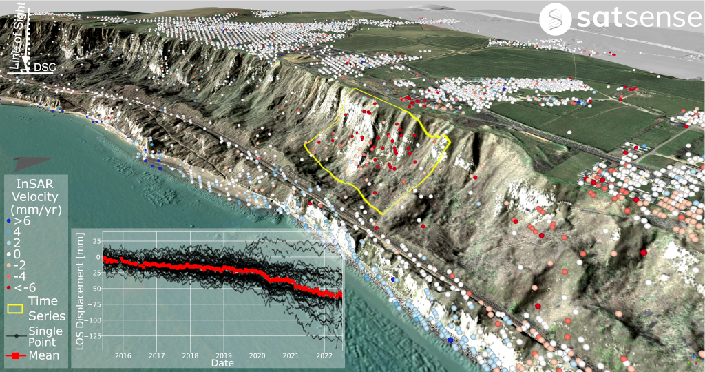
SatSense's processed InSAR data provides an alternative remote monitoring solution for asset management. At Folkestone-Warren, SatSense supplied this service to monitor the mainline railway across an active landslip as part of a successful pilot project with Network Rail. Whilst there has not been any major movement recorded since 1939, recent ground movements have forced the implementation of speed restrictions over the past few years. Our InSAR monitoring has provided additional means for Network Rail to analyse these movements both temporally and spatially. Timeseries revealed both periods of steady movement and acceleration whilst the coverage extent demonstrates clear landslip dynamics through signals at the head and toe of the landslide (Figure 1).
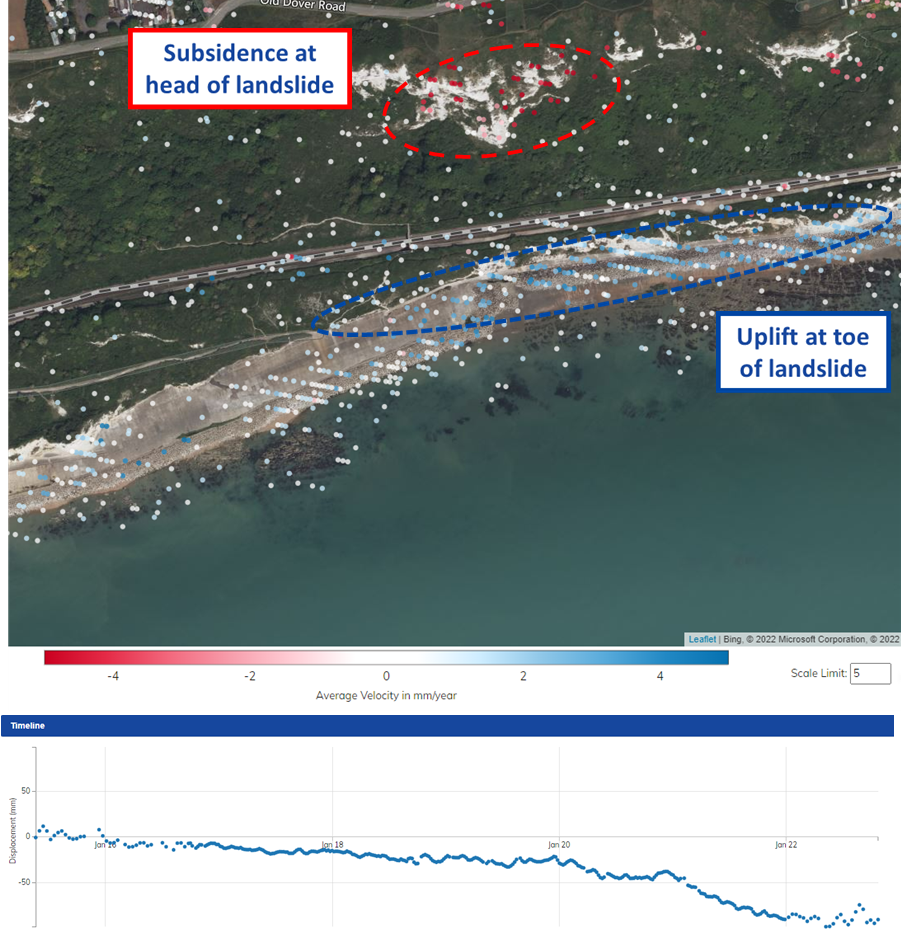
SatSense descending InSAR velocity data overlain onto satellite imagery with timeseries for the head of the landslide. Motion away from the satellite is considered negative and shown in red whilst motion towards the satellite is positive and displayed in blue. This can be interpreted as the head moving West or more likely subsiding and the toe moving East and/or uplifting. The data history demonstrates the head experienced both steady movement and periods of acceleration accumulating in -60 mm of movement since the record began in 2015.
A key aim of the project was to perform blind data comparisons with existing peg ground-based monitoring for approximately 50 sites across the Folkestone-Warren. The InSAR data and peg data showed high agreeability using Network Rail's "Movement/No-movement" qualification criteria (Figure 2). Comparisons of the total displacement at an individual location for any datapoint of the
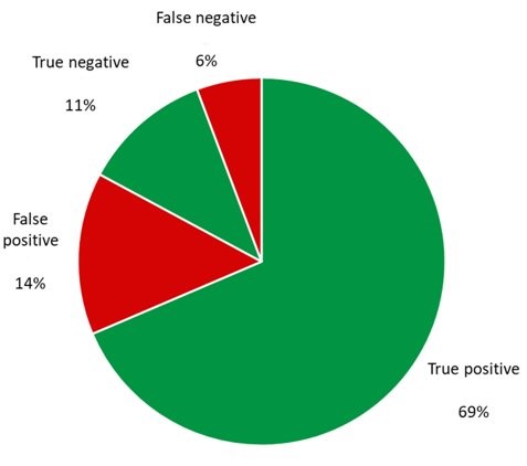
Blind data comparison where false positive represents movement predicated by InSAR but not observed by peg data.
Comparisons of the total displacement at an individual location for any datapoint of the timeseries also showed agreeability (Figure 3). This correlation between peg monitoring and InSAR data is even greater using velocity rates as this accounts for multiple datapoints across the timeseries.
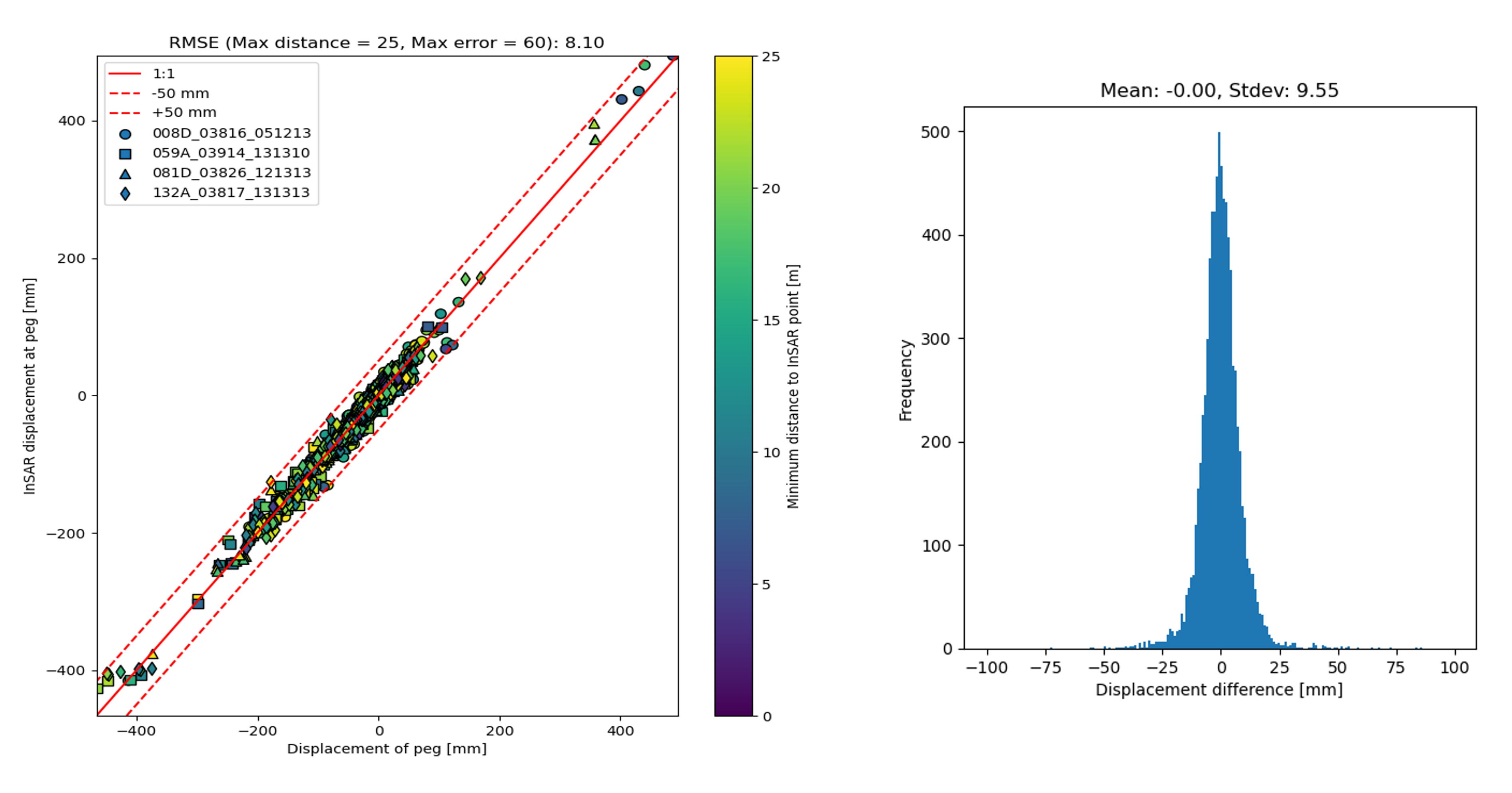
LHS: Total displacement measured by InSAR and peg monitoring at every datapoint for all reviewed locations.
RHS: Displacement difference between total displacement measured by InSAR and peg monitoring at every datapoint for all reviewed locations shown in figure 3 (RHS).
SatSense's InSAR data updates every 6 days as new measurements are obtained and processed in near real time. This has significantly cut the interval time for Network Rail's ground movement monitoring from their previous 30-day peg monitoring intervals. Additionally, our InSAR data increases measurement coverage (Figures 5).
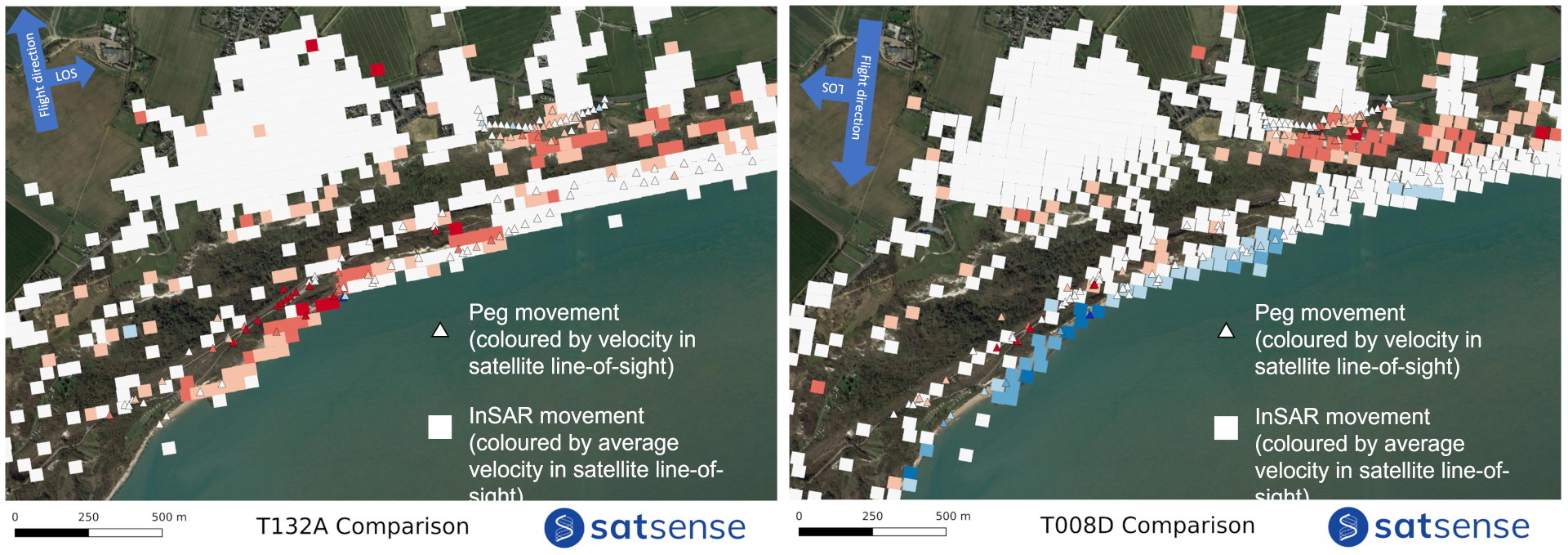
InSAR vs peg monitoring plotted for ascending pass (LHS), and descending pass (RHS).
This data was also plotted against peg monitoring data, and showed similar movement trends between the InSAR and peg monitoring (Figure 6). Though notably the InSAR data has longer temporal coverage.

Displacement time-series comparing peg monitoring and InSAR data.
Subsequently National Rail has requested our InSAR monitoring to complement and supplement existing ground-based monitoring at other known unstable sites. SatSense's remote InSAR data additionally helps to minimise costs for Network Rail extensive railway infrastructure network due to the reduction in site visit requirements.
3D model illustrating movement over Folkestone and associated time-series for the area highlighted in yellow.